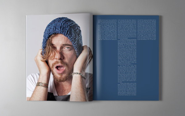
Tuesday, December 18, 2012

Double Spread Development: Front Introduction to Article 1

6. 
My Comments:
The typography before was a little plain and boring. I spread out the letters in the title 'Wojceich'. I was trying to achieve a triangular formation and also when I do so, the typography seemed to form the letter 'W'.
Inspired by this:

Added the letter 'T' from my masthead to the page numbers to show continuity of the pages of the magazine. However, it was too big, the photo covered most of the letter. 

7.


My Comments:
Edited the text below the title. Made it flow better. Instead of just starting with S.A.F.E. Heaven, which no one has a clue about. 

8.

My Comments:
Thought the text was a little wordy so I edited the first part out.

9.


My Comments:
Put the original text back, because the triangle shape of the letters that I was trying to achieve wasn't successful with lesser words. Added a quote to the photo to make the photograph of hm using the camera link to the music interview. However, the page overall looked too wordy. The quote seemed out of place. 

10.

My Comments:
I felt that since the photo was a little out, I removed it. The page became boring, I need something to 'pop'. So I changed the 'W' to neon yellow. 

11.

My Comments:
Added a little inverted triangle to hold the text together. 

Friday, December 14, 2012

Double Spread Development: Front Introduction to Article

1.


2.

My Comments: 
I thought the quote from the artist links well with the photo on the right.


Font is inspired by: (below)


3. 

My Comments:
I wanted to add some graphics that gave the spread an edge. So I did a 'W' in illustrator to put over the image. Changed the size of the letters: "Photos and Text by Rebekah Lee" used to be bigger. 


4. 
My Comments:
Thought that the line should go all the way up. 


5.
Researched typography and article layout conventions


My Comments: 
Redid the text below the title, became more catchy. Stated the obvious but yet not stating it an obvious but a more informative approach. 


Initial Idea: Double Spread 1

Rough Sketch for my first Double page 


Interview Article: Researched typography and article layout conventions


Researched typography and article layout conventions

Front Cover: Layout


The balloon looks to "extra".
Colours are good. 
Covering too much of the selling line. 

Too Simple and not exciting enough like the indie magazine's cover.


Evaluation of Masthead

I started off googling and researching different mastheads and found out that Mastheads are generally very catchy, captures the buyers attention and speaks what the magazine is about. The selling line helps to tie in it and summarize more about the magazine. Also, good mastheads should not be just downloaded from the internet and stuck to the top of the magazine. They should be even slightly altered to fit the magazine.

Then I proceeded to doing a mind map to get my Masthead name. After loads of research, I finally found the one- Timbre pronounced as Tamber. It was everything I was looking for in my magazine.  Its meaning: "the unique of an instrument, its voice" is what I wanted to go for in my magazine. I wanted my magazine to stand out from the crowd and presents itself to the buyers for what it represents - an indie acoustic magazine.

Designing the Masthead came next. I started just playing around with fonts but none of them seemed to match my magazine, what I wanted. I started going in deeper and questioned myself, what do I want from my Masthead and how do I want it to represent my magazine. Well, so acoustic to me means real and pure; while indie to me means independence. Hence, so I though wood was very suitable because it is raw and natural, just like acoustic and indie. So I decided to use a wood font and had a line slashed across to seem as if it was a restricted or rather exclusive magazine to those that truly loved indie acoustic music.  

After getting my main Masthead right, I wanted a selling line to tie in the Masthead and the magazine more. So I started playing with fonts and narrowed down to a few. Even though I decided on one, it didn't work with my magazine, so I had to change it. 


I like my Masthead a lot because it has a lot of meaning behind it. Also, I think it is visually appeasing to the eye and it goes well with my front cover as well as the nature of my magazine. I think my magazine is quite different from the rest because I haven't actually seen an indie acoustic music magazine before. Therefore, I think that my Masthead is very suitable for this magazine. 


Masthead: Final


Even though I said the first masthead was better, as I was doing my front cover layouts the masthead below was better suited for my photos and general look of my magazine.

Case Study: AnOther Magazine


 AnOther Magazine's TARGET GROUP

Advertising:
The advertising in AnOther Magazine is limited to less than 35% of the magazine, the choice of advertisers is selective and the important campaigns are showcased in depth.

Character:
High-flying, educated and international and associate themselves
with high culture.

This audience is loyal to the AnOther Magazine brand and as our 2009 reader
survey shows they are the true tastemakers in fashion and luxury.

Lifestyle:
Our readers have an AB rating of 68%* and 61%* shop at designer boutiques more than
3 times a month.

AB 68%*
ABC1 97%*

Standard:
82%* of Another Magazine readers have a University degree, a percentage unrivalled by any title in the sector. United by their intelligence as much as their affluence Another Magazine readers want to experience the fashion collections in a refined magazine alongside the best of contemporary art and culture, and in an environment free of celebrity gossip and downmarket advertisers.

91%* are tired of celebrity gossip.
82%* are interested in design innovation.
79%* are interested in redefining the idea of luxury.
72%* are concerned about the environment and say it already affects their choices as a fashion consumer

Age Group:
49%* of AnOther Magazine readers are in the 25-44 demographic, a powerful 32%* are
45+.
Proof that AnOther Magazine reaches into the high spending over-40s demographic more than any other magazine in the sector.

Age 18-24 19%*
Age 25-34 26%*
Age 35-44 23%*
Age 45-55 17%*
Age 55+ 15%

Gender:
Women 72%*
Men 28%*


Income:
Average Income £88,279* ( High Income)


Readership:
Readership 606,930**

Iconic Covers:

Portraying Hollywood stars in never before seen ways with unparalleled creativity and a strong fashion message.
Past cover stars include Nicole Kidman, Jodie Foster, Gwyneth Paltrow and Natalie Portman.

Thursday, December 13, 2012

Interview Article: Questions

Brain storming some Interview Questions.

1. How, when and why did you get started in making music?

2. If you had to listen to one music artist in your whole life, who would it be?

3. What are your songs about?

4. What do you think about downloading music online?

5. Tell me a most memorable day in your life. 

6. What inspires you to do what you do?

7. Why music?

8. What do you think about when you play your music?

9. What kind of music do the people around you listen to?

10. What is your greatest fear?


Interview Article: How to write an Interview Article?


I googled how to write an interview article:


Time Required: 1-3 hours

Here's How:

  1. Deal with the actual interview. You'll leave your interview either with a set of notes, a sound recording, or (preferably) both. While the interview and interviewee are still fresh in your mind, you'll want to tidy up your notes and check any special spellings or names.
  2. Wait a day or two after the interview was conducted. This should allow you to clear your mind of any preconceived subjects or storylines. You want the interviewees's words, ideas and actions to set the agenda- not your own. If you use a recording device, you may want to consider hiring a transcriptionist to put the recording into writing for you. This acheives the same purpose.
  3. With a pen and paper in hand, read the transcript in its entirety. Write down any broad subjects that stick out to you-- are there any items, events or ideas that the person seems to be going back to? Anything mentioned twice, or with great passion? Try to gather at least three to five broad subjects from this first reading.
  4. Narrow down these broad items. This is a good time to re-read the assignment from your editor. Did she specifically ask for a slant on the subject's meaty childhood? Is he looking to promote a certain service? Compare your broad subjects to your research on the person (conducted before the interview even took place, right?), to your editor's wishes, and perhaps even to your own interest in the person. Then, pull out and refine these broad subject areas, and place them (temporarily) in your transcript as your subheads. If you like, you can rename them to catch subhead titles now, or, see where the article goes.
  5. Using Word's cut and paste function, pull the interviewees quotes about each subhead into that subhead area. You are now pulling the subjects words out of the chronological order that they occurred in during the interview, and placing them, instead, under subject heads/subtitles/main idea areas. It is not necessary to pull whole paragraphs. At this point, you'll have a feeling of the direction your article is going in. Get the best quotes sorted, and leave the rest.
  6. This is where you practice your craft. You'll now have three to five subtitles, depending on your target length, and some great quotes about those subjects. It is now your duty to go in and introduce the subject, the history, the research, and why each idea is important. Then, use transitional phrasing such as "Mr. Blank agrees..." or "Mrs. SoAndSo makes this clear when she..." to move into your subjects quotes. Finish out the paragraph, subtitle or idea with more research or exposition, and wrap it up or transition it to the next subtitle.
  7. With the middle of your article done, it's time to write the introduction and conclusion. The introduction should reflect on the article in general, and also frame the interviewee in some way. Many writers will avoid giving boring facts in the first paragraph. "Mr. Blank was born in..." likely won't hook a reader as well as an astonishing story, quote or fact from Mr. Blank's life. The conclusion often refers back to the introduction, or to some interesting part of the interview, and sometimes gives a look ahead to the interviewee's future plans.
  8. Re-read. Revise. Re-write. Repeat.

Tips:

  1. Conduct research on your subject prior to interviewing.
  2. Follow your editor's specifications and listen to their take on the interviewee's interest points.
  3. Allow yourself a day or two after the rough draft before editing, if possible.

What You Need

  • Assignment
  • Interviewee
  • Notepad or MP3 recorder
  • Transcriptionist
  • Word processing software