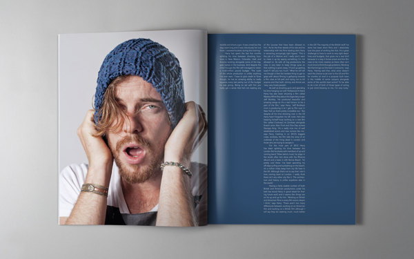
Initial Idea for First Double Spread:
Rough Sketches for my content page
____________________________________________________________________________
First Double Spread:
1.
2.
My Comments:
I thought the quote from the artist links well with the photo on the right.
Font is inspired by: (below)
3.
My Comments:
I wanted to add some graphics that gave the spread an edge. So I did a 'W' in illustrator to put over the image. Changed the size of the letters: "Photos and Text by Rebekah Lee" used to be bigger.
4.
My Comments:
Thought that the line should go all the way up.
Researched typography and article layout conventions
5.
My Comments:
Redid the text below the title, became more catchy. Stated the obvious but yet not stating it an obvious but a more informative approach.
6.
My Comments:
The typography before was a little plain and boring. I spread out the letters in the title 'Wojceich'. I was trying to achieve a triangular formation and also when I do so, the typography seemed to form the letter 'W'.
Inspired by this:
Added the letter 'T' from my masthead to the page numbers to show continuity of the pages of the magazine. However, it was too big, the photo covered most of the letter.
7.
My Comments:
Edited the text below the title. Made it flow better. Instead of just starting with S.A.F.E. Heaven, which no one has a clue about.
8.
My Comments:
Thought the text was a little wordy so I edited the first part out.
9.
My Comments:
Put the original text back, because the triangle shape of the letters that I was trying to achieve wasn't successful with lesser words. Added a quote to the photo to make the photograph of hm using the camera link to the music interview. However, the page overall looked too wordy. The quote seemed out of place.
10.
My Comments:
I felt that since the photo was a little out, I removed it. The page became boring, I need something to 'pop'. So I changed the 'W' to neon yellow.
11.
My Comments:
Added a little inverted triangle to hold the text together.
____________________________________________________________________________
Front Cover: Layout
Front Cover: Layout
I printed them out, and found out that the 'wooden' part was too distracting and you couldn't see the number properly. Also, my first double spread looked "too white".
I redid the the page number and extended the photo for the first double spread to remove the "whiteness". Looks darker here than on paper actually.
____________________________________________________________________________
Final First Double Spread


No comments:
Post a Comment