Trying out different Masthead Ideas using Illustration
Some Mast Head ideas for my upcoming media project on creating a school magazine. Dabbled with illustrator to produce some of these. Heehee.
Number 1:

Number 2:
(My name spelled backwards ^^)

Number 3:
No relation to anything or what so ever.

____________________________________________________________________________
Final Masthead design
“Peep” is the title of my school magazine because Peep is all about giving you a glimse of individuals in the school which have such a different and diverse way of showing their creativity and personality. Well, its just a peep of what I’ve noticed in school and I’m just sharing it with the rest. The “ee”’s in the peep were made to look like binoculars.
I used illustration to create this masthead.

____________________________________________________________________________
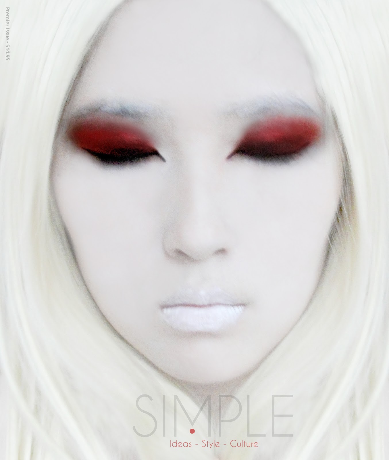
Planning the Photograph for Front Cover
Personally, I hate photos that are so normal. With the posy front cover and the normal typography. Usually for those magazines, I think it’s the content that makes the audience want to buy the magazine. The cover is so full of information and bright colours that were meant to grab the audience’s attention but I just think that the magazine is plain messy. So I want to go for a cover that a customer would want to buy because the looks and content-wise are great.
My magazine would be about how different ISCA students present their creativity and individuality. For example: in fashion, illustration, photography or graphics. For my “photograph”, I want to incorporate all those mediums into my front page photograph. As for my model, I will choose Mayuko as her fashion style is really amazing. Mayuko’s style includes many different colours and textures; it is almost like a replica of her personality. I chose a prop for her, the omg necklace, as it represents people’s reactions when they first see her style. Also, it will be placed on her mouth as people are usually stuck for words when they describe her style. Graphic comes in with the play of different saturations of the photo, inspired by the catalogue magazine. The tint of colours on her, kind of shows the fact that she looks colourful on the outside and also behaves like that on the inside. I will crop the photo into a shape of a circle because it illustrates the viewers looking through a telescope. This ties in with the Masthead as the “ee”s look like binoculars. For illustration, I have decided to extend the image, using pen, that I have cut out, making the photo a medium sized one. My background would be plain and simple because I want the full attention to be on my photo.
____________________________________________________________________________
Research for Front Cover:


____________________________________________________________________________
Research for Front Cover:


____________________________________________________________________________
Taking the Actual Photographs for Front Cover
I wanted to take a series of photographs with different angles, perspectives and different distances from the model.
CLOSE-UPS:


MEDIUM-SIZED CLOSE-UPS:


MEDIUM-SIZED:


I like this photo above because of the white space around the model.
FULL-BODY:


MEDIUM-SIZED CLOSEUP SILHOUETTE:


Changed the photograph to a negative image. The circle creates an illusion of a stethoscope.
DOUBLE EXPOSURE:


I like the amount of attention given to the closeups of the face as well as the attention to the outfit. However, it didn't fit the criteria of the photograph which was to be a medium sized photo.

The bird was supposed to be symbolize freedom. This is because at ISCA, we are free to explore and express ourselves in anyway.

Tried to combine black and white with color. Not very successful.
____________________________________________________________________________
Trying Out Different Front Cover Layouts


Trying out different saturations to illustrate her colorful personality.

Added a shadow. Looks more like a peep hole.

Its like an X-ray of my model. Shows that she is as vibrant on the inside as she is on the outside.


Above: I like it because its like half X-ray and half human at the same time.


Above: I like the fact that the 'OMG' sign stands out a lot.

Tried out the back cover in white.


Black background is more striking and gives an illusion of actually looking through a hole.
____________________________________________________________________________
Final Front Cover and Evaluation
Final Front Cover:
.png)
Evaluation:
First I had to think about what my Magazine was going to be about, what is was going to feature. After, I had to start designing my masthead. I designed a few of them and finally came to a conclusion to use the masthead ‘peek’ because it relates to my magazine the most. Also, the design matched the name. Finding a model for my cover came next. I chose Mayuko because her style matched very nicely with my magazine, bright and happy. Planning the layout, finding the right typography for my magazine. All in all, I think my time management was quite good and I was experimental enough to get what I wanted. However, overall, I think my idea only worked to a certain extent. It was successful because it turned out 80% of what I envisioned it to be. In addition, the masthead was really successful to me. It was prominent, name and design relates to my magazine very well, and most importantly I think the name is very memorable. I liked the fact that my magazine was square, different from the rest. The photo didn’t turn out too well, a little disappointing. The sign ‘omg’ that I wanted to stand out, didn’t. I tried to add shadows above the sign but it just looked as if she had a moustache. Decreasing the opacity helped slightly only. I could have made the sign black or used better lighting. The fonts were a problem too. I tried experimenting with different fonts, but some was not noticeable from far. Some just faded into the black background. Could have tried to find more solid fonts. I researched a lot of different magazines that caught my attention and inspired me. The main magazine that inspired me was the Catalogue Magazine Singapore, Issue 95. You can see the link by just looking at the photograph in the front cover as shown by the different layers of saturation that I used. In that case, I think I was being very experimental and it is successful to me. I think I met all the targets. I would give myself a ‘B’ because I still could improve many aspects of my magazine.
____________________________________________________________________________
Content Page Research


V Magazine
Above and Below: I like the way the masthead is included in the content page.

Esquire Magazine

Above: I like how the content page layout and design relates exactly to what the magazine is about without about words.


Above: The line that cuts his face a little off the middle makes it look more interesting and unique.

Above: LOVE LOVE LOVE. Love the simplicity, typography, images used.


Above and Below: I like the photo layouts and the text and the bottom.

____________________________________________________________________________
Content Page Mockup Design and Final

Above: Rough design.

I forgot my magazine was square so I had to make alterations to my previous designs.
All photos taken by me.
____________________________________________________________________________
Photographing Better Quality Image for 2nd Peek Cover
Task:
Better quality image
Medium frame Closeup
First Photoshoot:
This wasn't actually taken for my magazine, it was more of an experimental piece using objects found in the studio. Then I thought, I am the one photographing this piece of art so its kind of a peek of what ISCA students are doing. Since sarah, alice and I were ISCA students, why not use these images as the front cover. This photoshoot, of pure spontaneity, to me was about capturing the true soul of the person though their eyes as they hide in layers of what we thought of was always their true selves.
DSC_0606(5).jpg)

2nd Photoshoot:
This photoshoot, too, was not meant for my magazine. It was for Alice's magazine and I was lucky enough to be asked to help her take the photos of what she visioned for her magazine model to look like. We were kind of looking at facial pieces again. I thought it was very interesting with the gold face paint, which didn't work out very well so she put gold hair spray on her face. The texture of the face paint and the hairspray formed very interesting textures on her face so I decided to try it out in black and white to make them stand out even more. I also started experimenting with shadows.
DSC_0671.jpg)
DSC_0718(1).jpg)
DSC_0717_2(1).jpg)
DSC_0733.jpg)
DSC_0700(1).jpg)
DSC_0687.jpg)
DSC_0702.jpg)
DSC_0703.jpg)
DSC_0679.jpg)
2nd Edition Peek Front Covers
-page-001.jpg)
-page-001.jpg)
No comments:
Post a Comment